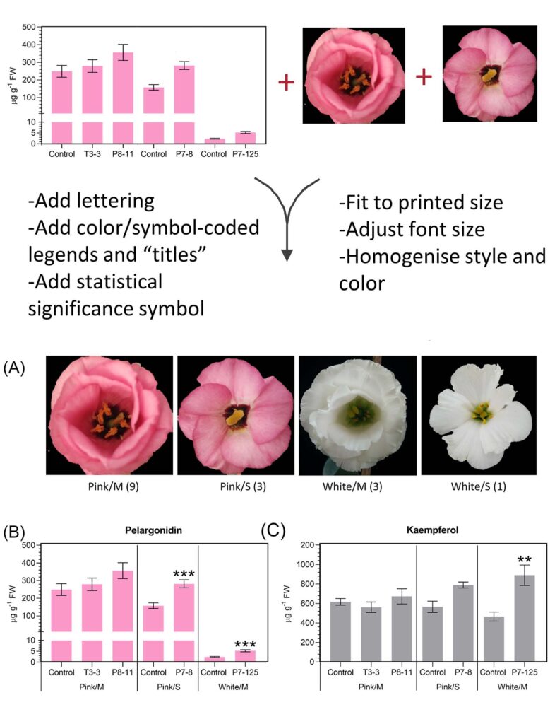
We have assembled here a guide on how to make great figures. Your figures should stand out, be clear and cohesive. They are the face of your article.
What are the components of a figure?
A graph (also called line art), a photo, alone or in combination. Graphs (done with excel, SigmaPlot, Origin) and photo (cropped and adjusted) often require an extra step (mounting) to ensure that all figures of a manuscript are homogenous in style and size.
A figure should be as self-explanatory as possible.
Nice, homogenous figures are time-consuming to obtain but shouldn’t be neglected. You may have graphs coming from different people, or done at different time points and you will assemble them.
You may either have to redo some of them from scratch or you will have to adjust them afterwards.
At the end, it should look like all your figures were done simultaneously with a clear style.
Getting the resolution right
Your figures can either be pixel-based (Pictures, scans, figures made with Photoshop, Krita, Power point, Gimp) or vector-based (Illustrator, Inkscape, Corel draw). Resolution is expressed either as PPI (point per inch, digital screen) or as DPI (dots per inch, ink dots on a paper). Though many journals are online-only, they still refer to dpi as articles are often printed.
Pixel-based
CAN’T be scaled without loss of resolution.
Vector-based (points connected by equations)
CAN be scaled without loss of resolution.
Save each raw file (one graph, an image…) at 600 dpi. Pumping resolution afterwards is not helping.
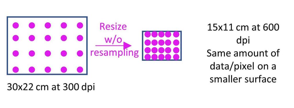
If saving at 600 dpi is not possible, increase the size of your figure and save at 300 dpi. You can rescale at 600 dpi afterwards (without resampling, i.e: the amount of pixels will stay the same but on a smaller surface)
Pumping resolution
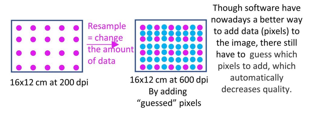
Increasing resolution by rezising
Color choice
Use a limited color palette reoccurring throughout your manuscript.
Always use the same colors in graphs for your control and other samples. Match the colors of your graph with eventual photo accompanying the figure.
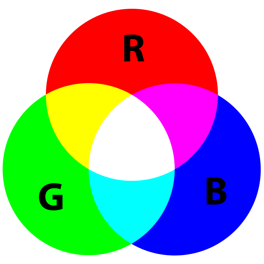
RGB has a great color range. As articles are read online or printed on office printer that convert nicely from RGB to CMYK, RGB is a good choice.
Colour-blindness: No red-green combinations
TIPS ImageJ, a freely available program, converts red into magenta . Open the figure in Image J (it opens all formats). In the tab ‘Image’, choose ‘lookup table’ and then ‘magenta’.
Layout and scaling
To ensure homogeneity in font size and in the overall appearance of your figures, it is best if you adjust them directly to the correct final printed size.
Ca. 80 mm width for 1-column image; 125 mm for 1.5 and 166 mm for a 2-column image
TIPS A minimal final font size of pt.8 (Arial) is recommended. Keep the font range between pt.8 and 11 (Arial). Use always the same font size for axis, lettering etc. throughout your figures.
How to mount your figure
Mounting a figure means assembling all part of a figure together. It takes time to find the best layout, align the objects, homogenize font size etc.
Creating the graphs, adjusting figures and mounting do not used the same tools. Here, we listed some of the common tools:
Graphs
Excel
SigmaPlot
Origin
Do all graphs using the same color palette and the same font. For best results, it is preferable to add axis legend afterwards (when mounting).
Images
Photoshop
Krita (free)
Gimp (free)
Before being mounted, images should be cropped, adjusted (same light/contrast adjustments should be applied to a series of images) and resized.
Mounting
Power point
Illustrator
Inkscape (free)
Below, you will find some tips about all of them.
Power point: good and easy tool for rearranging your figures provided you override some of the defaults parameters
-make sure your imported photos are not compressed. File>option>Advanced>Image size and quality: high fidelity.
-Fit your figure to one slide.
-copy and paste (keep source formatting and embed workbook) graph from excel. You can then easily modify them (color, line thickness, tickmarks…)
-Save as tiff. But you have to override the default parameter to ensure good resolution.
See how: https://www.youtube.com/watch?v=NBtPno3VFec (use 600 dpi)
Illustrator: good (but expensive), save files as .eps while working on it but save it as pdf before test-printing or submitting. In the pop-up window appearing when saving as pdf, unclick all options in the “general” area of the dialog box, choose “do not downsample” and “compression zip” in the “compression” area.
Inkscape: save as .svg while working but as pdf for good and light figure to submit. In the window that opens change “resolution to rasterization” to 600 dpi.
Choosing the format
.tiff = NO compression & NO LOSS of quality & information. But files are big.
Compress large tiff files without loosing quality by using LZW compression
.png = NO LOSS of information, color range of 16 millions colors
.pdf = Convert your tiff or eps into lighter pdf files.
! Check your pdf output settings to keep the resolution of the original images. Your pdf should look as good as your tiff or eps.
Image processing
Photographic images submitted to the journal should be minimally processed but often require adjustment to give them justice!
Changes of brightness, contrast and colour balance are allowed if they are applied to the whole image and equally to controls, provided that no information in the original image is misrepresented by the adjustments.
Images from different parts of a gel, or from different gels, that are grouped into a single figure must be clearly separated, e.g. with a space.